CALLIGRAPHER | CYCLORAMA
Quick links to more art terms and definitions are located at the end of the list.
Calligrapher
An artist skilled in the art of calligraphy, which involves creating beautiful and expressive handwriting or lettering using specialized tools like pens, brushes, or quills. Calligraphers focus on the precise and deliberate arrangement of strokes to achieve harmonious and visually stunning compositions.
Calligraphy
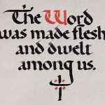
A distinctive style of artistic handwriting that is created by using special pen nibs or brushes that allow a calligrapher to vary the thickness of a letter’s line elements. An elegant, decorative writing style developed as an art form itself and used to enhance the artistic appeal and visual beauty of handwritten papers and manuscripts.
Camden Town Group of Painters
(Visual arts: painting. Art movement: London, 1911-1913.)
A group of Post-Impressionist artists from London, who met weekly in Walter Sickert’s studio. Their goal was to break away from traditional artistic groups and introduce French bohemianism to the English art scene. Drawing inspiration from Van Gogh and Gauguin, they drew on scenes of London life, including music halls and urban settings. Despite their expressive use of color, their paintings remained representational and realistic, reflecting a modern aesthetic distinct from Parisian developments. In 1913, the Camden Town Group was absorbed into the London Group, which was formed by the merger of numerous smaller groups of contemporary English painters.
Canvas
A term used by artists to describe the surface they create their paintings on. It also refers to a heavy, closely woven fabric that is affixed to a piece of thin cardboard (see canvas board below) or that is stretched onto stretcher bars (see stretched canvas). Canvas material is typically made of linen or cotton. Also see blog article title “Three Types of Oil Painting Canvas” for more information on this topic.
Canvas Board
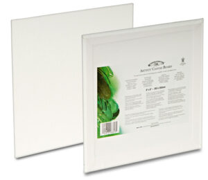
A rigid surface covered with primed canvas glued onto lightweight cardboard, approximately 1/8″ thick. They are durable, resistant to warping, and less fragile than stretched canvas. Canvas boards are preferred by artists for smaller paintings and are easy to frame. They are ideal for on-location painting because their lightweight, and the sunlight will not shine through the back. Also called “canvas panel,” which is a term that is interchangeable with “canvas board.” For more information see blog article “Three Types of Oil Painting Canvas.”
Canvas Paper

A textured, coated paper with a flexible surface resembling a canvas, used for small sketches and color notes. It comes in pads or single sheets and is not recommended for painting due to its fragility and lack of longevity. Works painted on canvas paper require extreme restorative and conservative treatments, usually within a few decades.
Caricature
An artistic representation where certain features of a subject are exaggerated to create a humorous or grotesque effect. This can be done through drawing, painting, or other artistic methods. Caricatures often highlight distinctive traits, making them more pronounced than in reality, but still retaining a likeness.
Center of Interest (in art)
Refers to the part of a composition that draws the viewer’s attention the most. It’s the focal point that captures and holds the viewer’s gaze, making it the most important element in the artwork.
Key aspects of a center of interest include:
-
- Contrast: Using differences in color, value, or texture to make the area stand out.
- Placement: Positioning the center of interest strategically within the composition.
- Detail: Adding more intricate details to this area compared to the rest of the artwork.
- Color: Utilizing vibrant or contrasting colors to attract attention.
The center of interest helps guide the viewer’s eye through the artwork and enhances the overall impact of the piece. Also called the “focal point.”
Ceramics
The art of making objects with clay and firing them in a kiln. Wares of earthenware and porcelain, as well as sculpture, are made by ceramists. Enamel is also a ceramic technique. Ceramic materials may be decorated with slip, engobe, or glaze, applied by several methods, including resist, Mishima, and snag gam. Pots can be made by the coil, slab, some other manual technique, or a potter’s wheel.
Charcoal
A stick made from compressed burned wood used for drawing and for preliminary sketch work on canvases. Compressed charcoal is available in a variety of forms, including stick, wood-encased pencils, and peel-as-you-go paper wrapped pencils, that range from extra soft to hard.
Chiaroscuro
An artistic technique that uses strong contrasts between light and dark to create a sense of volume and three-dimensionality in a composition. The term comes from the Italian words “chiaro” (light) and “scuro” (dark).
Key aspects of chiaroscuro include:
-
- Contrast: The use of light and shadow to highlight certain parts of the composition.
- Volume and Depth: Creating the illusion of three-dimensional forms on a two-dimensional surface.
- Dramatic Effect: Often used to evoke a sense of drama or intensity.
This technique was popularized during the Renaissance and Baroque periods by artists like Leonardo da Vinci, Caravaggio, and Rembrandt.
China Clay
(Also called kaolin.)
A type of fine white clay used in ceramics and porcelain production. It’s valued for its smooth texture and ability to enhance glazes and clay bodies.
Christian Art

A genre of art that depicts important Christian themes and stands as a testimony to faith. Images of Jesus Christ, as well as scenes from His life and ministry are the most common subjects of Christian art. It is significant because it deepens our understanding of Christianity and the Bible. Also called “sacred art.” See also, “religious art.”
Chroma
The brightness or saturation of a color describing its intensity or how pure it is. High-chroma colors are more saturated, while low-chroma colors are less pure and more pastel in tone. See also “Color Saturation.”
Chromatic
Pertaining to color or colors; being or having or characterized by hue. A color perceived to have a color saturation greater than zero.
Cityscape
A painting of a city landscape. Artistic representations that capture the physical features of a city, urban life, and specific locations of a town (such as a city block, street corner, outdoor café, rooftops, etc.), or other metropolitan areas. It’s the urban equivalent of a landscape, offering glimpses into the heart of cities and the rhythm of daily life. Similar to cityscapes are “townscapes.”
Classic Still Life

Traditional compositions that typically features inanimate objects arranged in a deliberate composition. These objects can include items like fruits, flowers, glassware, books, and other everyday items. Classic still lifes often emphasize the beauty and texture of the objects, using light and shadow to create a sense of depth and realism.
Classicism
Refers to an aesthetic attitude and style that draws inspiration from the themes, techniques, and subjects of ancient Greece and Rome. It spans approximately from the formation of Greek city-states in the 8th century BCE to the decline of the Roman Empire in the 5th century CE. Artists who embrace classicism seek to echo the elegance and wisdom of those ancient civilizations.
Classicism places significance on timeless values associated with art from antiquity. These principles include:
-
- Harmony: Striving for balance and order in composition.
- Idealism: Representing forms in their perfected state.
- Proportion: Ensuring harmonious relationships between parts.
- Restraint: Avoiding excess or flamboyance.
- Balance: Achieving equilibrium in visual elements.
Closed Composition
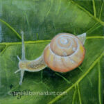
A type of composition in painting or photography where all the elements are contained within the borders or framework of the canvas or image. The main subject is usually located near the center drawing the viewer’s eye to it. All the other compositional elements help guide the viewer’s attention to the subject matter and away from the edges. Such a composition often results in static, consistent, stable images that feel complete, finished, and calm. Still life‘s and portraits are good examples of closed composition.
A closed composition is the exact opposite of “open composition.”
CMYK

The abbreviation for cyan (C), magenta (M), yellow (Y), and black (K). These are the four primary colors used in process printing that are combined in varying amounts to produce a wide range of colors.
Collage
Introduced by the Cubists, the technique of creating a work of art by adhering flat articles such as paper, fabrics, string, or other materials to a flat surface such as a canvas whereby a three-dimensional result is achieved.
Color
A basic element of art that involves light. It is produced when light waves (wavelengths) strike an object and are reflected into our eyes. Each light wave has a distinct color. Objects appear to be different colors because some wavelengths are absorbed while others are reflected or transmitted back to our eyes resulting in the colors we see.
Color Field Painting
A style of abstract painting that emerged as an art movement in New York City during the 1940s and 1950s. It is mostly distinguished by broad expanses of solid, flat color that lack sharp tones or contrasts and spread across the canvas, creating flat picture planes and sections of uninterrupted surface. There’s no clear focal point of interest. The primary focus and theme is color, which is heavily emphasized.
Color Groups (in art)
Refers to the systematic arrangement of colors used to create harmony and visual interest in a composition. Also called “color schemes” or “color families.”
Some common color groups include:
-
- Analogous Colors: Colors that are next to each other on the color wheel, such as blue, blue-green, and green. These colors usually harmonize well and create a serene and comfortable design.
- Complementary Colors: Colors that are opposite each other on the color wheel, like red and green or blue and orange. These pairs create a high contrast and vibrant look, especially when used at full saturation.
- Split-Complementary Colors: A variation of the complementary color scheme. It uses a base color and the two colors adjacent to its complementary color. This scheme offers high contrast like complementary colors but with less tension.
- Triadic Colors: Three colors that are evenly spaced around the color wheel, such as red, yellow, and blue. This scheme is popular for its vibrant and balanced look.
- Tetradic (or Rectangular) Colors: Four colors arranged into two complementary pairs. This scheme offers plenty of possibilities for color variation and is the richest of all the schemes.
- Monochromatic Colors: Variations in lightness and saturation of a single color. This scheme is elegant and easy on the eyes, creating a cohesive and harmonious look.
Understanding these color groups can help you make more informed choices in your artwork, enhancing the overall visual impact.
Color Harmony
The relationship of colors that work well together side-by-side, as opposed to colors that clash with one another. It can be a simple relationship involving only one color with several shades (monochromatic) or two complementary colors, or it can be a more complex relationship involving multiple colors.
Color Opposites
Pairs of colors that are directly opposite each other on the color wheel. These pairs create a high contrast and vibrant look when used together. Some of the more common color opposite pairs are: Red and Green, Blue and Orange, and Yellow and Purple. See also “Complimentary Colors.”
Color Permanence
Refers to a pigment’s lasting power. Tubes and other paint containers are sometimes labeled with a code indicating a color’s degree of permanence.
Letter Code |
Degree of color permanence |
| AA | Highest |
| A | Standard |
| C | Less than permanent, though fairly durable |
| CC | Fugitive |
Color Properties
The three primary qualities of color are: hue (the name of the color), chroma (the purity and strength of the color), and value (the lightness or darkness of the color). Also called hue, saturation or intensity, and lightness.
Color Saturation
Refers to the intensity or purity of a color. It describes how vivid, rich, or intense a color appears. Here are some key points about color saturation:
-
- High Saturation: Colors are bright, vivid, and pure. They stand out and attract attention.
- Low Saturation: Colors appear muted, dull, or grayish. They are less intense and can create a more subdued or harmonious effect.
Saturation is one of the three properties of color, along with hue (the color itself) and value (the lightness or darkness of the color). Adjusting saturation can help set the mood, create contrast, and focus attention in a composition.
Color Scheme
The overall selection and arrangement of colors used in a design or artwork. See “Color Groups” for more information.
Color Separation
A traditional photographic process of separating artwork into component films of cyan, magenta, yellow, and black in preparation for printing to ultimately create a full-color printed product. Recent computer innovations have obviated the need for separated film negatives in specific applications.
Color Temperature
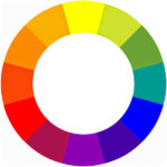
The temperature of color is how a particular color is perceived, either cool or warm. Cool colors range from green to violet on the color wheel, whereas warm colors range from yellow to red. Each temperature takes up one-half of the color wheel. Somewhere in the green and violet spectrums, the temperature changes between cool and warm. Also reference “cool colors” and “warm colors.”
Color Theory
Practical guidelines that govern the ideas, principles, and applications of color in art and design. Color theory consists of three components: the color wheel, color harmony, and color application or context, which can all be used by visual artists to create logical structures in their designs and compositions.
Color Wheel
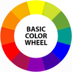
A circular diagram, developed by Sir Isaac Newton in 1666, that visually represents the placement of colors in relation to each other. It is divided into 12 sections, each showing a distinct color, and categorizes colors into primary, secondary, and tertiary (third) categories. Artists and interior designers use this as a visual aid to understand color relationships and define color schemes.
Colored Pencil
A drawing tool with a pigmented core, used by art students and professionals. Can be wax- or oil-based, water-soluble, or pastel.
Colorimetry
A field of science and technology that studies how the human eye perceives color. Colorimetry uses numbers to describe colors and is used in various industries like chemistry, color printing, textile manufacturing, and paint manufacturing.
Commercial Art
Refers to art that is made for commerce. The term is somewhat obsolete and is currently being replaced in many colleges with the term “Visual Communication.”
Commission
Refers to the act of hiring someone to execute a specific work of art or set of artworks. For more information on this topic, see “How to Commission a Painting.” The term may also refer to the fee charged by a gallery or agent when selling works to a third party.
Complementary Colors
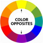
Two colors that are directly opposite one another on the color wheel. When placed next to one another, complementary colors are intensified and often appear to vibrate. This contrast can be used to draw attention to specific elements in a composition. Additionally, when mixed together, complementary colors can neutralize each other, creating a more muted or grayish tone. Also called “color opposites.”
The complementary or color opposites are:
Primary Color and Opposite |
Secondary Color and Opposite |
Tertiary Color and Opposite |
| Red and Green | Yellow-orange and Blue-violet |
Red-violet and Yellow-green |
| Yellow and Violet | Yellow-green and Red-purple |
Red-orange and Blue-green |
| Blue and Orange | Red-orange and Blue-green |
Blue-violet and Yellow-orange |
Complete Abstraction
(Also called nonobjective art.)
A type of abstract art that takes things a step further. Here, there’s no trace of any reference to anything recognizable from the real world. Artists working in complete abstraction create purely from their imagination, intuition, or emotional response. Their compositions don’t rely on depicting specific objects or scenes.
Composition
The arrangement of the elements of art within a design area in accordance with the principles of design, ensuring unity and consistency in a piece of art, allowing the observer to comprehend its meaning.
Computer Art
Refers to visual images made with the assistance of computers. Computer art is often made with drawing, painting, illustrating, and photographic programs or applications like Adobe Photoshop or Illustrator.
Concept Art
A type of visual art created during the preproduction stage of a movie, video game, or other complex visual work, primarily aimed at explaining and evaluating various concepts before advancing to the final product.
Concept Artist
A creative professional who develops visual concepts for media such as films, video games, and animation. They design characters, environments, and props, working with directors and producers to establish the visual style.
Conté
A drawing medium made from compressed powdered graphite or charcoal mixed with a clay base. It is a firm pastel used for detailed work and is known for its classic earth colors, including sanguine, bister, black, whites, and grays. Also known as Conté sticks or Conté crayons.
Contemporary Realism
An art movement that thrives on well-executed, representational paintings. These artworks are created with meticulous technical skill, emphasizing the tangible and recognizable. Within this movement, artists delve into various sub-categories:
-
- Figurative Realism: Capturing the human form and its nuances.
- Narrative Paintings: Telling stories through visual compositions.
- Photorealism: Meticulously reproducing scenes with photographic precision.
- Hyperrealism: Taking realism to an almost surreal level, where details are rendered flawlessly.
Contemporary Still Life
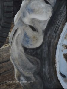
A modern take on the traditional still life genre, often integrating aspects of current culture, technology, and artistic creativity. Diverging from the classic still lifes that emphasize realistic depictions of objects, contemporary versions tend to be abstract, conceptual, and inclined towards experimentation.
The terms “contemporary still life” and “modern still life” are frequently used interchangeably, they do have distinct meanings based on the time periods and artistic approaches they represent. Contemporary art refers to works created from the late 20th century to the present day. The characteristics of Contemporary still lifes often incorporate elements of today’s culture, technology, and media. They can be more abstract, conceptual, and experimental, using a variety of media including digital art, photography, and mixed media. Themes such as consumerism, identity, and the passage of time are commonly explored.
Contour Drawing
An outline of something, especially one that defines its shape or form. Contour drawing is a technique where the artist sketches the outline of a subject, capturing its shape and mass without focusing on intricate details. This method emphasizes the overall form and structure, often creating a three-dimensional effect through the use of lines.
Contour drawing is a fundamental skill in art, helping artists improve their observation and rendering abilities. It’s particularly useful for quick sketches and can be a great exercise for both beginners and experienced artists.
Contrast
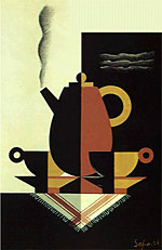
A design principle that emphasizes the difference between two or opposing elements, forming a unified composition. It adds variety to a design, preventing monotony and confusion. Contrast also adds visual interest by comparing light and dark areas, lines, forms, and spaces. It creates unity by drawing the viewer’s eye into the artwork, guiding them around the piece. Too much contrast can lead to confusion and monotony.
Convergence Lines
Cool Color
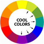
Colors whose relative visual temperatures make them seem cool. Cool colors generally include yellow-green, green, blue-green, blue, blue-violet, and violet.
The characteristics of cool colors include:
-
- are made with blue, green, or violet, and combinations of them.
- tend to feel cool, reminding us of water and sky.
- tend to recede into the background, i.e., move away from the viewer.
- are more calming and soothing.
Copyright
The legal right granted to the creator or assignee to print, publish, perform, film, or record literary, artistic, or musical works and authorize others to do the same. The copyright symbol ©️ (a circled capital letter C for copyright) is utilized in copyright notices.
Critique
An in-depth and analytical evaluation of a work of art, theory, or argument, aiming to provide feedback, broaden knowledge, or express opinions. It can be positive or negative, depending on the subject’s strengths and weaknesses. A good critique should be constructive and objective and focused on improving the artist’s work. For more information see blog article “How to Write a Constructive Art Critique.”
Cropping
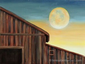
The removal of extraneous or unwanted parts of an image, usually a photograph. It involves excluding parts of a photo or illustration to show only the portion desired to fit a given space requirement. Cropping is often used to improve or redefine the composition or focal point of an artwork.
See blog article titled “Tightly Cropped Paintings: The Art of Focus and Intrigue” for more information.
Cubism
A 20th-century French art movement that uses two-dimensional geometric shapes to depict three-dimensional organic forms. A style of painting created by Pablo Picasso and Georges Braque in which the artist breaks down the natural forms of the subjects into geometric shapes and creates a new kind of pictorial space.
Curator
A person responsible for overseeing and managing collections in cultural institutions like museums, galleries, and libraries. Their responsibilities include the research, interpretation, and building of collections. As well as exhibition planning, educational outreach, and the preservation of collections. The term “curator” originates from the Latin word “cura” meaning “to take care.”
Cyan

A color that sits between blue and green on the spectrum. In printing, it’s one of the four process colors in CMYK (C stands for cyan) along with magenta, yellow, and black.
Cyclorama
A large-scale panoramic painting that covers the interior walls of a circular room, providing a 360-degree view of a continuous scene, typically a landscape. The goal is to give viewers the sensation of actually standing in the midst of the location that is depicted in the image. Real objects were frequently positioned in the foreground to heighten the senses. In the late 1800s, cycloramas became increasingly popular as a kind of entertainment that drew large crowds of people.
You May Also Like
This art terms dictionary is provided as a valuable resource for art enthusiasts. If you like the information here and find it helpful, please consider purchasing a painting. Your support helps to cover the cost of keeping this art dictionary online. Simply click or tap the thumbnail link of any Teresa Bernard oil painting to view additional details.
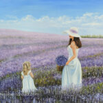
(2021)
24″ w x 18″ h
12″ w x 9″ h
Art Glossary Quick Links
Contributing to The Art Dictionary
The glossary of art terms and definitions is a work in progress. New terms and definitions are added on a regular basis. If you know of an art term and definition that isn’t already listed in it but you believe it should be, send it to us and we’ll consider adding it. We’ll let you know if we do. Thanks!
Thanks for reading this!
